i LURVE this one - aren't i lucky that i got to shoot her? I know i am! [click to view]

i think this one looks like a ray-ban ad or something. - V. was like, "why didn't you tell me to shut my mouth, lol?" - 'cause she looks so cool!

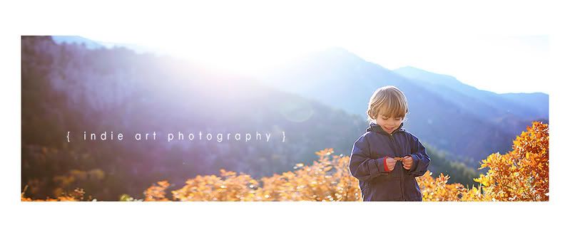
here's the original I stretched to fit the front of my new action site.
CHECK IT OUT HERE if you haven't seen it yet - [it's kinda pitiful that my action site looks better than my real website (which i'm STILL working on, btw)- but tell me what you think! i like my little "Indie Actions" logo i made - it's cute, eh?]

If you stretch the whole image, the person will be all distorted, so 1) first you use the "Rectangular Marquee Tool" on the floating toolbar to select the edges that you want to stretch. 2) Go to: Edit>Free Transform & 3) stretch to taste :) So notice how just the tree and the other end are stretched in the "after":

I've had a couple of "famous" photographers buy them, which is the HUGEST compliment. I don't know if they actually use them or not, but it was really fun to see
THIS - the Indie Folky action looked so.dang.awesome on that middle shot that it left me wondering why i don't use that one more often myself, lol?!?! Regardless, i LOVED seeing her senior pics of her sister - loved, loved, loved. She is amazing, isn't she? And speaking of, i got to do MY baby sister's senior pics, too, and will post them tomorrow! [I love them!!! - but, of course, i'm biased, because i love HER :)


